

UX/UI Project-Planning Center Study
-

Research
I chose to study an application called Planning Center. To understand where the application could improve for its users. This phase was just the research initiated to start the UX/UI Process.
-
Design
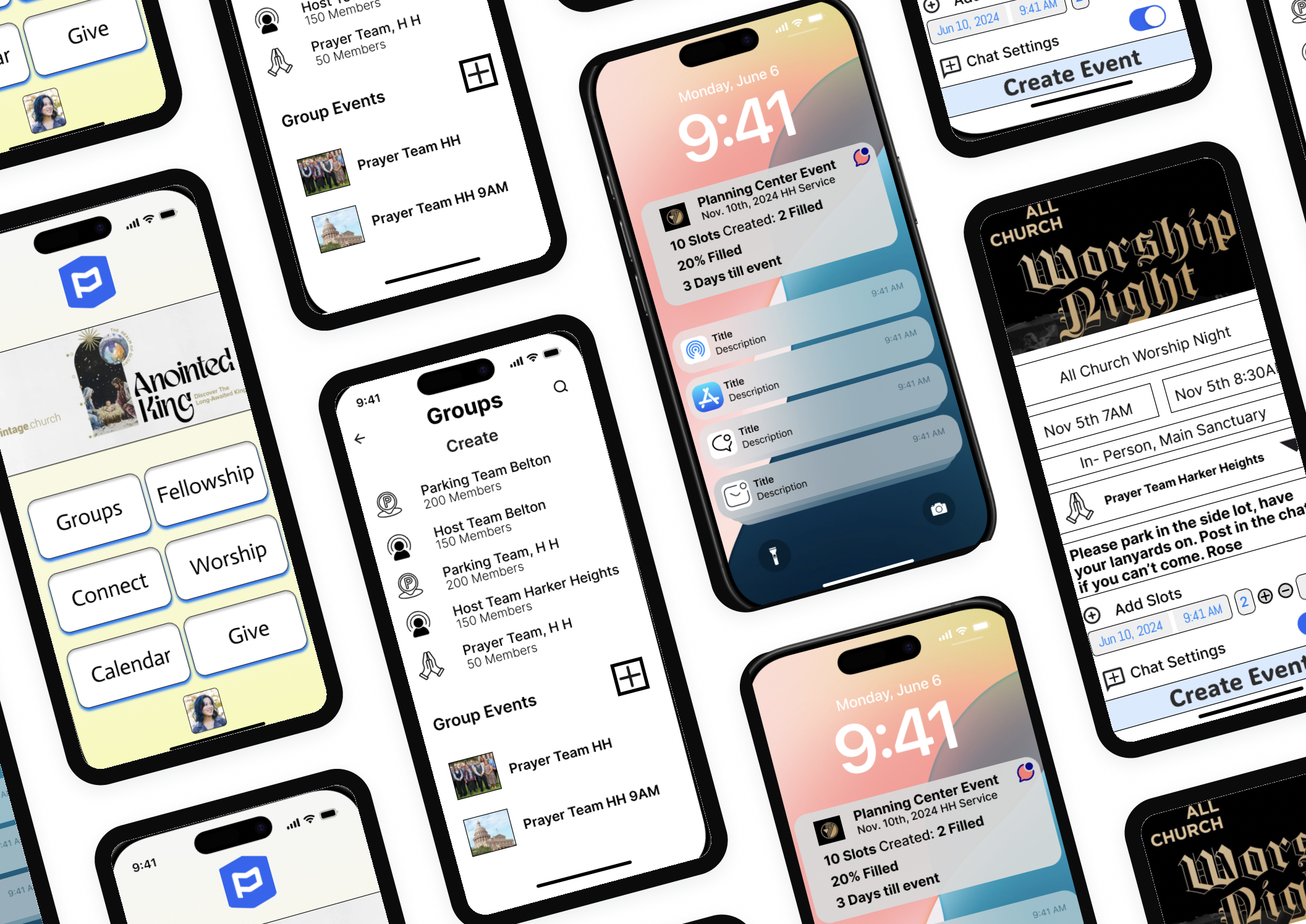
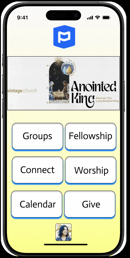
During this phase, I took one process within the Planning Center app and rebuilt it based on my research. The scheduling function was a big area of contention for users, so that was redesigned.
-

Wireframes in Figma
Here you will find all of my work in Figma which includes low & high-fidelity wireframes, and annotations. The presentations contain the data collected and quantified for stakeholders.
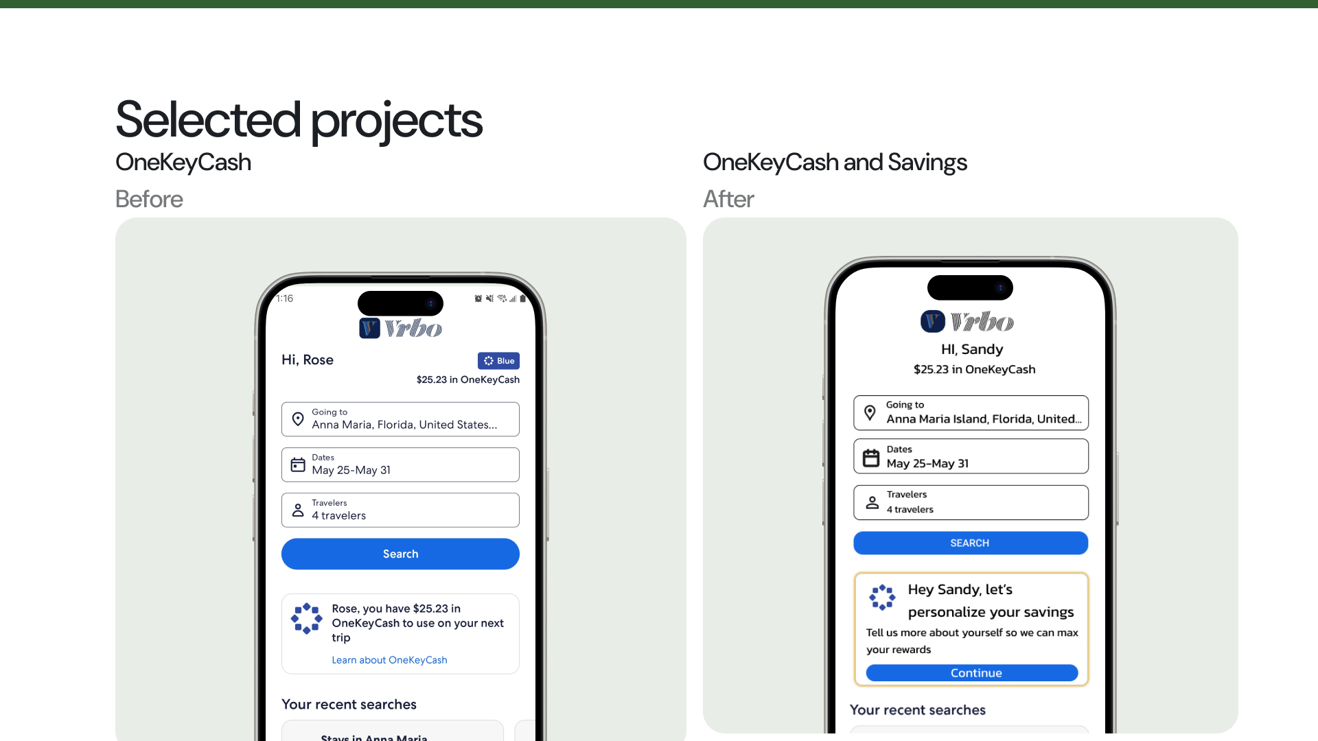
VRBO OneKeyCash and Savings
Before and After the UI/UX changes
The new rewards area features a button rather than a link that will take you to a customizable area of your favorite rewards.
Final Prototype
I enhanced OneKeyCash and the new savings feature.
Etsy UX/UI Testing
Etsy UX/UI Testing

Over 2 weeks, myself and two other students conducted a UX/UI Testing and review on Etsy. We tested 6 users to conduct a heuristic analysis and various data points to understand how to improve the user experience.